
VANNI · Fall/Winter 2026/27
VANNI Italian Kaleido
Italy, seen through familiar details. A deep green interior, a sunlit yellow wall, the glaze of a ceramic vessel. With Italian Kaleido, VANNI brings an Italian point of view to the colors, materials and everyday settings surrounding its eyewear.
The colors of Italy, from within.

The campaign
Italy, from an Italian point of view
VANNI describes the idea behind Italian Kaleido in a single line: “Not postcards, but details every Italian instinctively recognizes.” The campaign looks beyond the familiar shorthand of landmarks and holiday views to the Italy found in daily surroundings: painted shutters, polished stone, patterned tiles and the way light falls across a room.
Those details carry different moods. Deep greens, veined marble and brass-colored accents can suggest the composed elegance of a Milanese interior. Yellow walls, glazed ceramics and citrus recall the warmth of Sicily. These are associations rather than location labels: each setting brings together textures and colors that feel familiar without recreating a particular address or view.
The connecting thread is color as part of culture and everyday style. One dominant shade is complemented by two others, while warm light and defined shadows give the materials depth. The eyewear belongs within that world. Its patterns, translucent colors and contrasting outlines pick up the character of the setting and bring it onto the face.

Painted walls and shutters
Color in the everyday
A painted wall beside green shutters offers a familiar architectural detail, without a landmark to identify it. Red clothing continues the warmth of the wall, while violet optical frames introduce a different note. Their fine red accents connect the eyewear to its surroundings.

An urban interior
Echoes of Milan
Deep green, tailoring, foliage and a curved brass-colored detail suggest the quiet polish of a Milanese interior. The mood is intimate and composed. Against that setting, a dark patterned optical frame reveals small flashes of red and amber around its rounded lenses.
Ceramics and sunlight
A Sicilian warmth
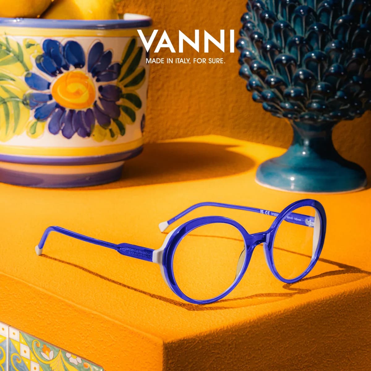
Painted ceramics, lemons and golden yellow evoke a Sicilian atmosphere through objects and surfaces close at hand. Glazed blues reappear in the round optical frame, whose curves sit naturally beside the ceramic forms. Light and shadow make the familiar setting feel vivid.
Small details, familiar moods
A warmer corner
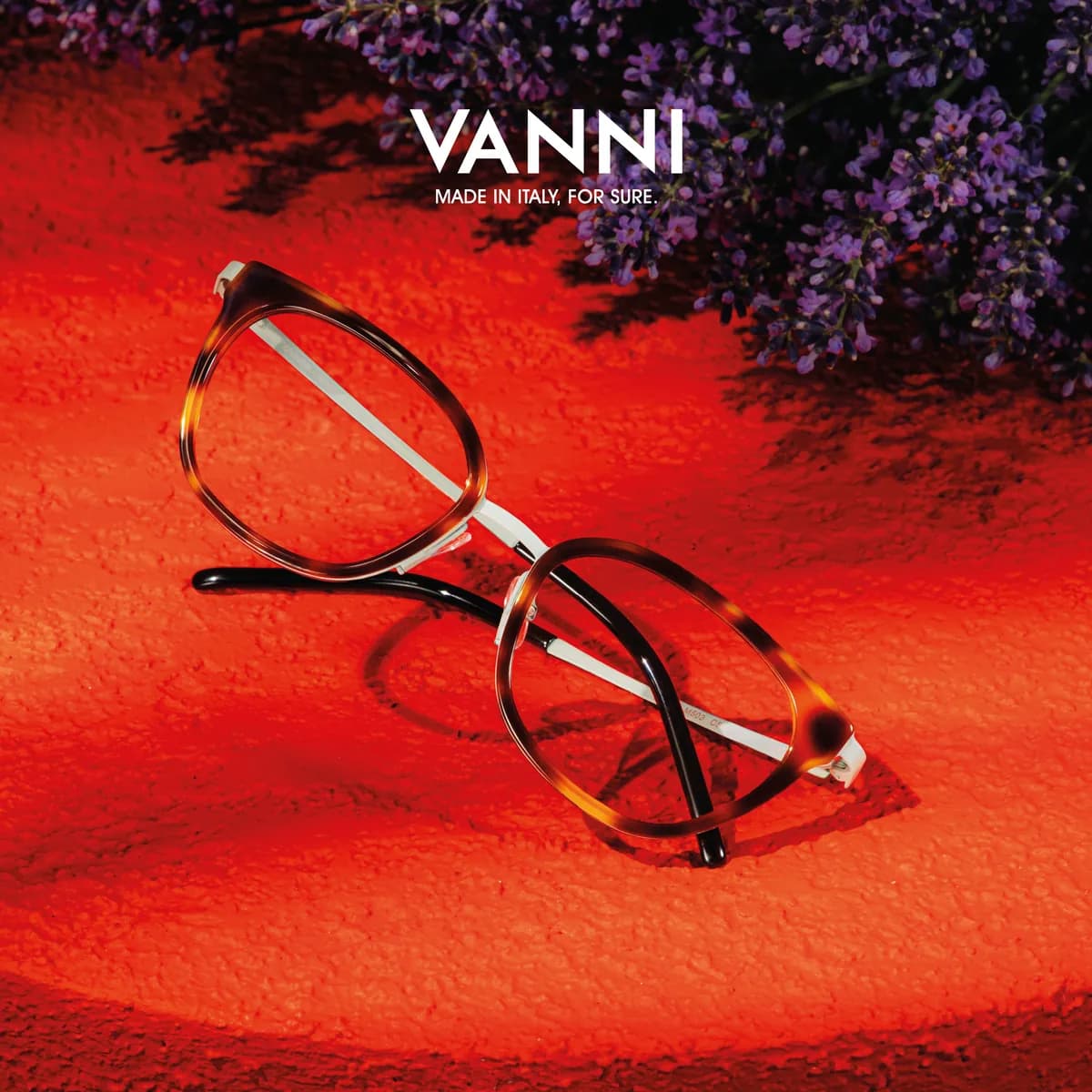
A cluster of purple flowers and the texture of a red surface create a small, richly colored corner. Amber and brown around the lenses carry that warmth into the frame, while a silver-colored bridge and temples give the composition a fine, clear line.
The interior, in detail
Green marble and a line of red
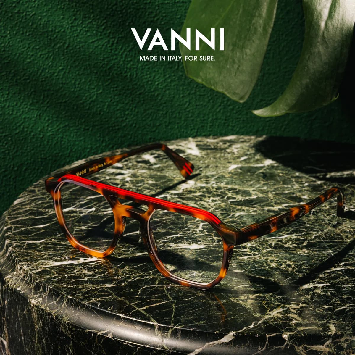
The green interior becomes a still life: polished stone, dark veining and a broad leaf. A tortoiseshell-patterned frame shares the richness of those surfaces. Its bright red brow accent introduces a sharper gesture, carrying the setting’s restrained mood into a more expressive frame.
Citrus and painted surfaces
Everyday color, unexpected company
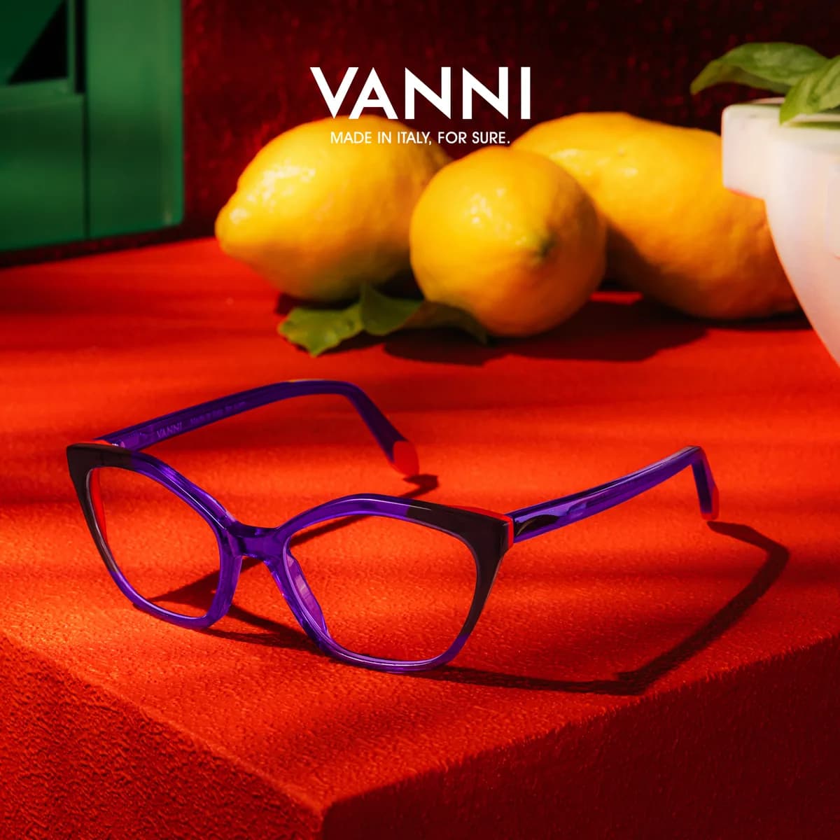
Lemons, a plant pot and painted shutters bring the scene back to ordinary objects. An angular violet frame adds an unexpected color beside the red and yellow. Warm light passes through its front and temples, making the eyewear part of the scene’s play of color and shadow.

Mediterranean light
The warmth carries through
Golden walls, yellow clothing and the shadow of a stone column carry the southern warmth into sunwear. Two blue frames provide a crisp contrast. The sense of place comes from the light and its effect on color, with each lens shape giving the shared palette a different expression.